n-Dimensional Charting Library for Asset Management
A JavaScript charting library written in d3.js that visualizes data in four or five dimensions, depending on the chart type, one of which can be time.
Javascript
d3.js
SVGs
Data Visualizations
HTML
Responsive Design
AWS Lambdas
The package supports the following chart types:
Bubble Chart
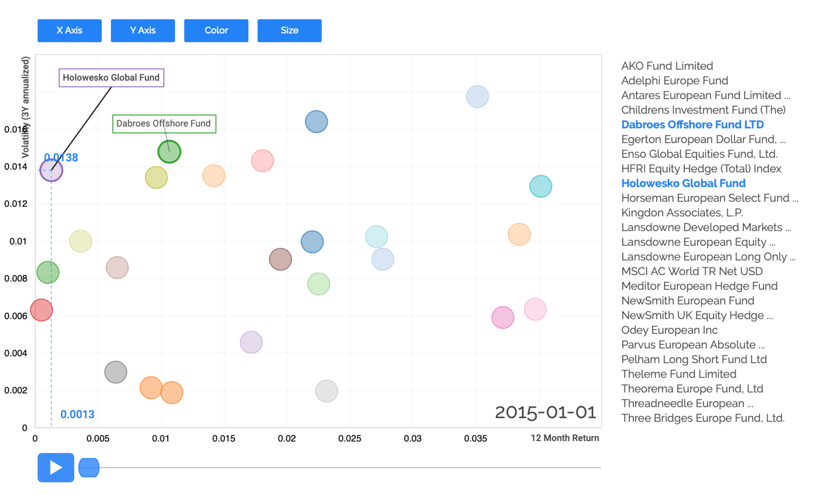
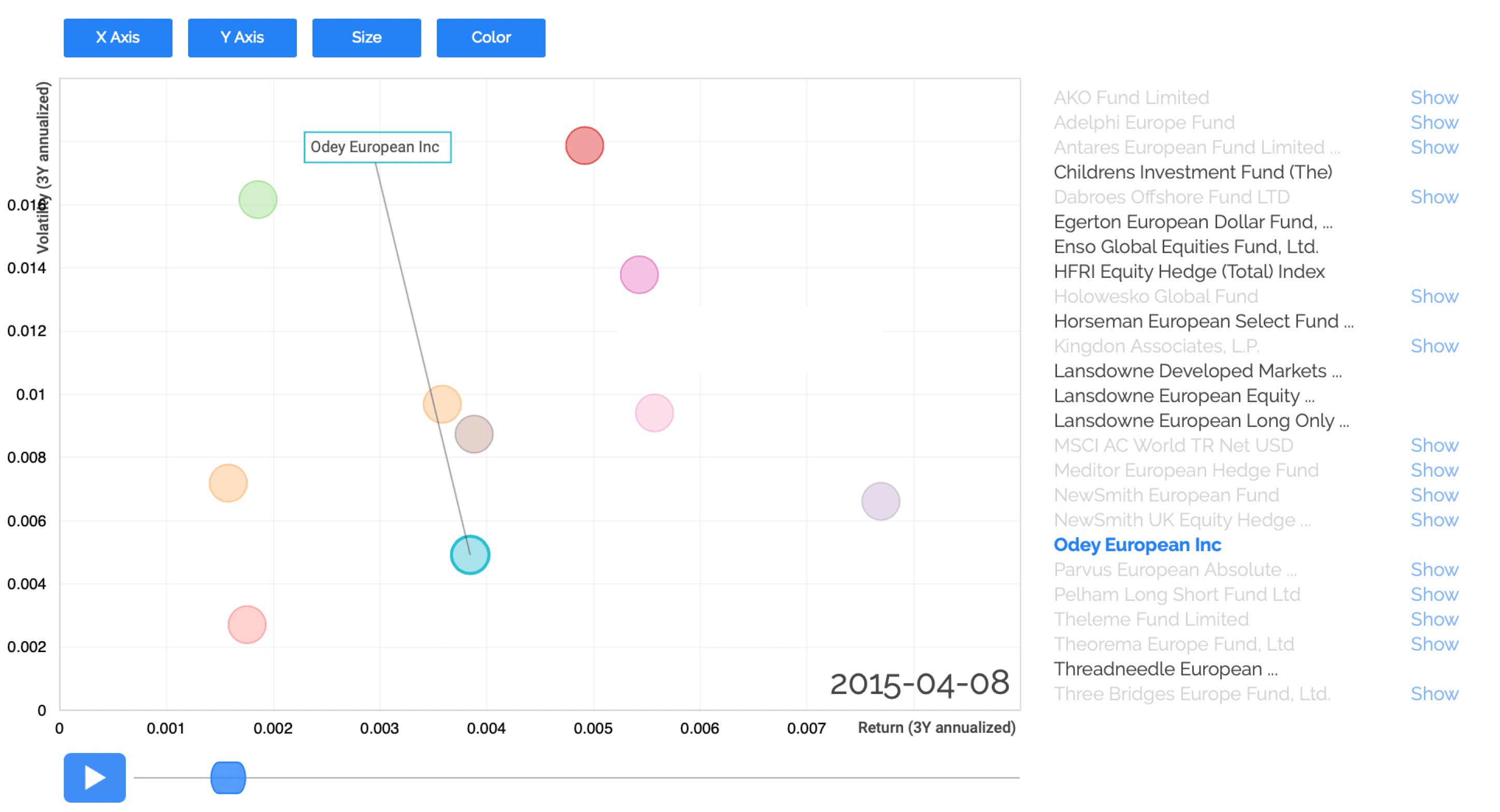
A Bubble Chart can visualize data in four dimensions at once (excluding time), each represented by one of the following characteristics of the chart:
X-Axis:
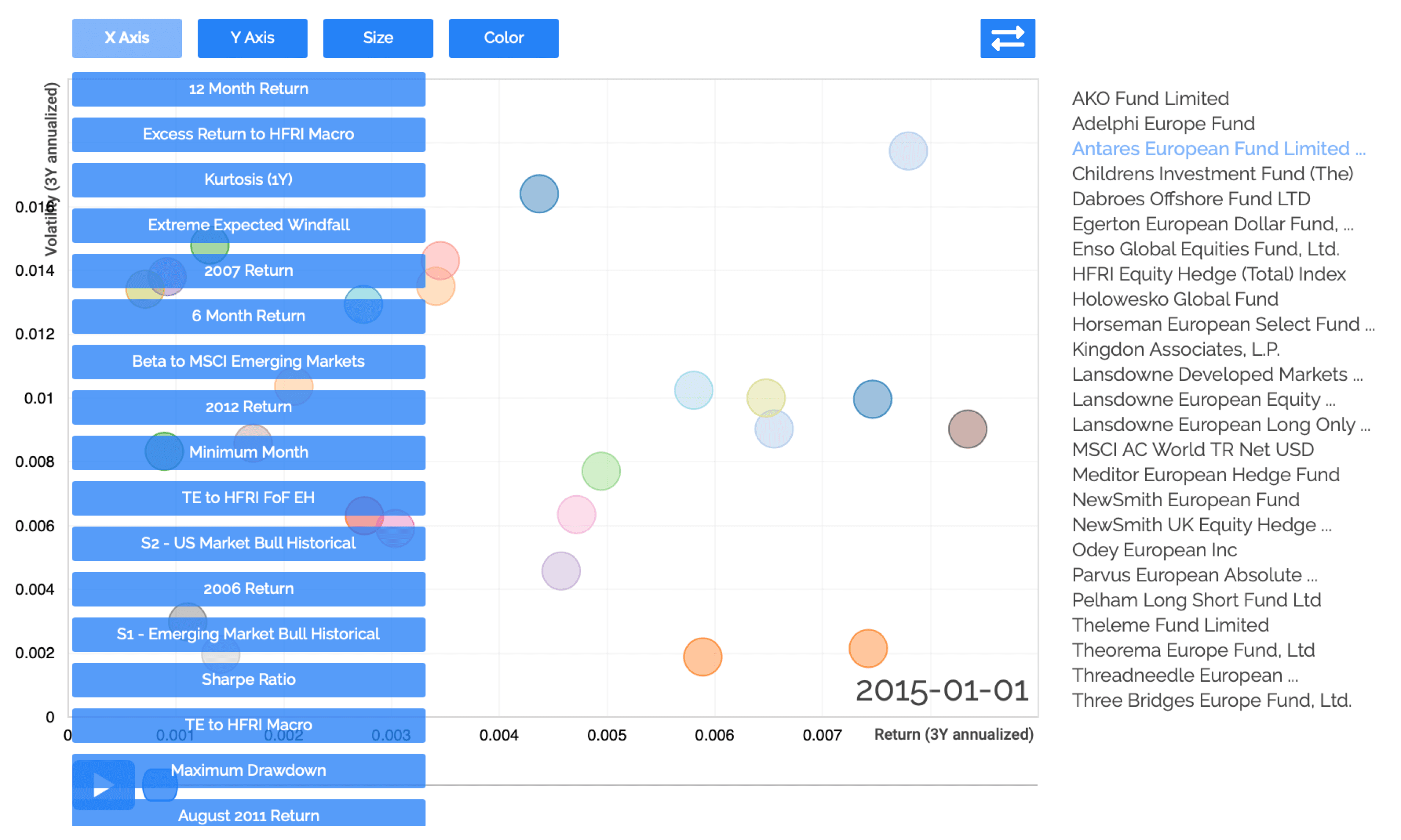
The x-axis can be configured with a dropdown menu to represent the desired metric. When a bubble in the chart is hovered, a dotted line indicates exactly where that data point sits on the x-axis.
Y-Axis:
The y-axis can be configured with a dropdown menu to represent the desired metric. When a bubble in the chart is hovered, a dotted line indicates exactly where that data point sits on the y-axis.
Color:
The color of the bubble itself can represent a dimension of the data. For discrete, string values, color can group bubbles that share the same value. For continuous, numeric values, shades of a color can represent the magnitude of the value.
Size:
The size of the bubble itself can also represent a dimension of the data. For discrete, string values, size can group bubbles that share the same value. For continuous, numeric values, the size of the bubble can represent the magnitude of the value.
Time:
If the data is provided as a time series, the chart includes a play button that animates the dimensions of the chart changing over time.
Bar Chart
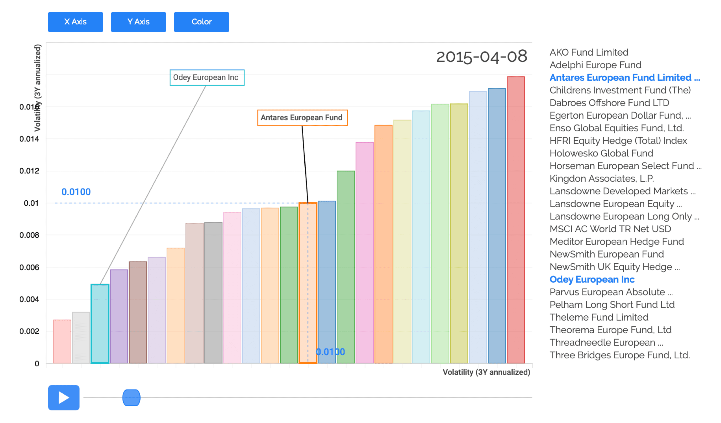
A Bar Chart can visualize data in three dimensions at once (excluding time), each represented by one of the following characteristics of the chart:
X-Axis:
The x-axis can be configured with a dropdown menu to represent the desired metric. When a bar in the chart is hovered, a dotted line indicates exactly where that data point sits on the x-axis.
Y-Axis:
The y-axis can be configured with a dropdown menu to represent the desired metric. When a bar in the chart is hovered, a dotted line indicates exactly where that data point sits on the y-axis.
Color:
The color of the bar itself can represent a dimension of the data. For discrete, string values, color can group bars that share the same value. For continuous, numeric values, shades of a color can represent the magnitude of the value.
Time:
If the data is provided as a time series, the chart includes a play button that animates the dimensions of the chart changing over time.